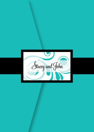
Since the fiance is not in love with our wedding colors like I am, I decided to compromise a bit and we decided to go with colors outside of our scheme for the invitations. We opted for an aqua (tiffany blue), black and white theme. The actual color of our invitations will be a metallic pocketfold called Tiffany Blue like this:
So I found the inspiration for my wedding and it's colors from a wedding posted on the blog of Joyful Weddings & Event Coordinators. While there, I also found the custom stationery company who did most of the work for that wedding and I contacted Stacia of Serendipity Design and asked her to help me out with our invitation and stationery needs. She is pretty affordable considering you are getting custom work done. I originally planned to make my invitations but decided it wasn't worth it based on the time, effort, printing, etc that would be required. This way, I still get to assist in 'making' my invites.
Here is what Stacia and I have come up with thus far...this is the most recent of our revised invitation:
Outside (will be wrapped with ribbon and bellyband closure):
Inside Pocketfold (inserts on right):
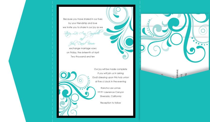
Close up of invitation and wording:
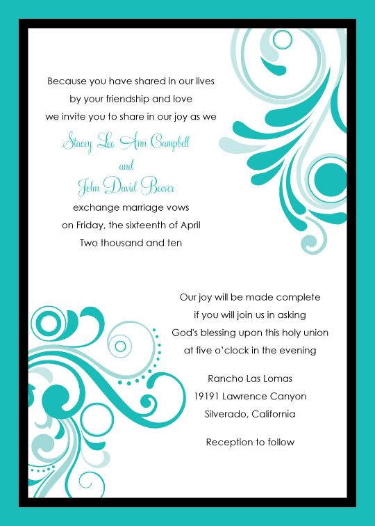
What I love is how the insert cards will be layered such that the graphic design on them flows from one card to the next as if it is one continuous design. I also love that this same graphic design will be incorporated throughout our wedding day on things like the menu cards, place cards, table cards, seating cards, favor tags, etc
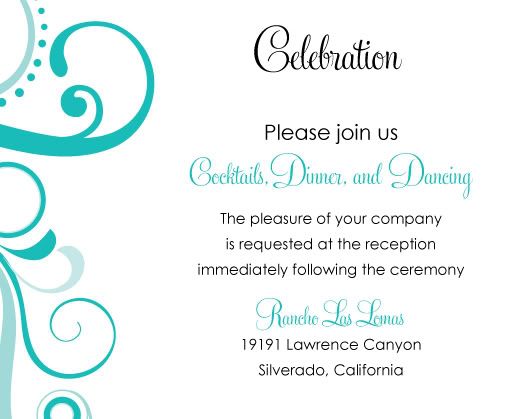
Here are some of the inserts and wording (she left off the word 'for' at the end of Please join us):
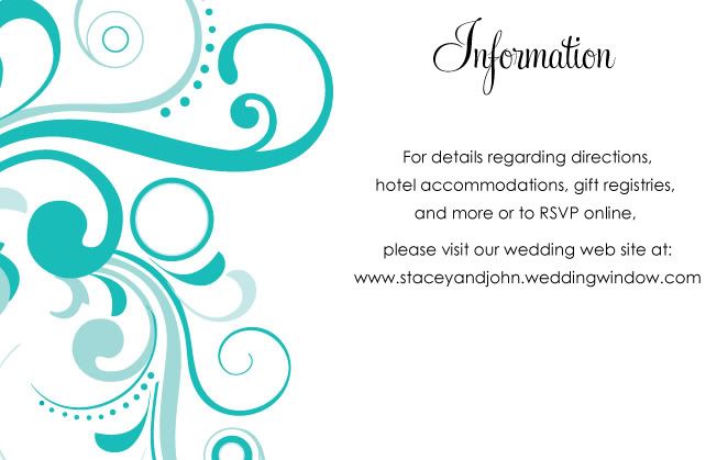
This insert will direct our guests to our wedding web site (I am going to have her space our web site address a little further down on the card so it stands out a bit more):
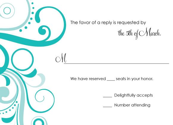
Here's the very unique part...there will be 4 insert cards in the pocket on the right. There will be TWO, count 'em 2, response cards...one for those who are accepting and another for those who have to decline. The back side of the Response card will have a place for them to list their family's name and number attending/declining. For the decline card, there will also be a couple blank lines for them to be able to write a brief message or well wishes if they can't attend. But the fun part? On the front of each response card will be a photo of my fiance and I. For those who can accept, this is the card they will return:
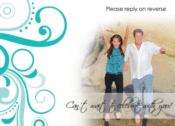
Notice that for our 'accepting' guests, we have placed a line on our invites that indicates how many people they can bring (We have reserved ____ seats in your honor). This way, if we invite a family of 4 with children and we fill in '2' seats reserved then they will know that their children are unfortunately not invited...or vice versa if they are. Of course, we will also be addressing the envelopes to confirm exactly who from each potential family is invited and whether or not a 'plus one' or guest will be allowed. But this extra added little line on the response cards just politely helps ensure that they know how many we are expecting or allowing.
And for those who have to decline, they will return this card:
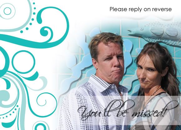
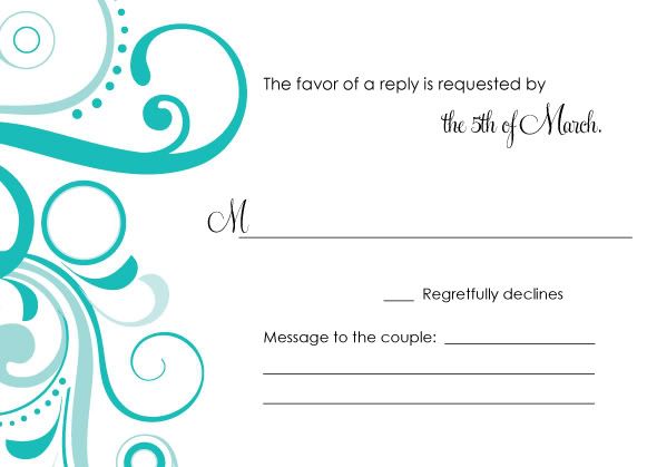
I am not thrilled with how these 2 photos came out from our engagement session so I think we are going to reshoot them. But I love the idea! I think it's so fun and unique and have to give props to my teenager for coming up with it.
So what do you think? Do you have ideas for your invitations or samples you want to share of something fun or creative or your traditional, classic sense of style? How well do you think your invites tied into your wedding theme or decor...did you carry anything from the invites over to the other aspects of the actual ceremony or reception?








18 comments:
These are beautiful invites! I love the idea of two different RSVP cards with different photos of you guys - so cute and unique.
Very beautiful. I love the 2 different RSVP's also. Great idea!
I agree, the 2-RSVP idea is a great one! And I am a sucker for Tiffany blue. Something about those little blue boxes always makes me so happy (gee, I wonder why)!
I like that you included pictures on your RSVP cards. It gives a personal touch.
I find it odd though that you have different RSVP cards for those attending and those declining. Why not just put them on one card?
Ashley, I don't know if you realized it but the RSVP cards are printed on both sides...the 2 photos are the reason why we have 2 rsvp cards. One has the image of us jumping with joy that they can come (thus the reverse has their acceptance reply) and the other has us pouting or looking sad that they won't be able to join us (thus the reverse has their declining reply). With the 2 photos, we wanted each reverse side to reflect the emotion of the pic. Plus, we wanted to leave space for those declining to be able to write us a message as I often find myself writing little notes in the blank space on my reply cards whenever I am unable to attend: "Sorry, we can't make it but can't wait to see the photos! Have an amazing day!"
Hope that helps clarify :)
These are beautiful! I love them. We dont' have a lot of money in our budget for invites so we'll be doing them ourselves but I may have to steal one or two ideas from you :) I love the idea of having a line noting how many people are invited.
I just found your blog!
I love your invitation suite...the two response card idea is so neat! And I love what you're going for with the pictures.
I love the tiffany blue of the envelope! and love the pictures of you guys in the reply cards!
You know I already think the invitations are awesome! I love the pic idea! Even if you keep the pics you have I think it works perfectly! We are having a similar invitation style and using the tiffany blue also!
They are beautiful!
I think they are so pretty! The photo on the "no" response is so cute, it's very unique. I really like pocketfold invites. I have been working on my DIY pocketfold invites and I am really curious how much you'll be spending on yours, they look great!
The invites are so fun! Love em!
Oh how I love pocketfolds - so pretty. Love your two RSVP cards - I think the photos are classic! We are trying to make our own invites - having major drama with the printing - and we are less than 8 weeks out! I am trying not to freak out. Wish we had just paid for them - you are totally doing the right thing!
Hey New Mexican Bride - I don't mind sharing costs of anything wedding related. The company I had make them (woman named Stacia) lives in Illinois so everything was done mostly via e-mail and with one phone call. I sent her lots of samples and ideas. She charged me a $100 design fee and the invites are $4.25 each. We are getting 125 of them. That's for the pocketfold invite, bellyband ribbon closure, and 4 insert cards with 2 of the inserts (RSVP's) having printing on both sides. The $100 design fee sounds like a lot but when you consider that she is also using the same design graphics on our programs, seating cards, place cards, menu/bar cards and some miscellaneous items, it's not that much to me. I totally recommend her if you can afford it. I looked at Magnetstreet invites first and the ones I was going to get were $3.50 to $4.50 each so this wasn't too far off and I got to be very involved in the design process and have them totally custom. :) The link to her site is under my vendor list. Be sure to tell her Stacey Campbell sent you if you contact her.
Oh thank you so much, I am glad you don't mind sharing the cost aspect of the wedding. I think that is very reasonable for the invites all printed and then having everything else match, they are very pretty and look like a good quality. I will blog about my DIY project and the estimated costs today. It's hard to decide to do them yourself or to have someone do them for you. Thanks again!
Your response cards are sooooo awesome!!!
The RSVP cards are awesome. So creative and fun!!!
~lilian~
Hahaha! Cute invitations! Love the backs!
Post a Comment